We recently photographed American House, a senior living community, in Southfield, Michigan. We captured exterior shots of the building, as well as interior, ranging from the common areas to the gym to the living spaces. Let’s check it out!
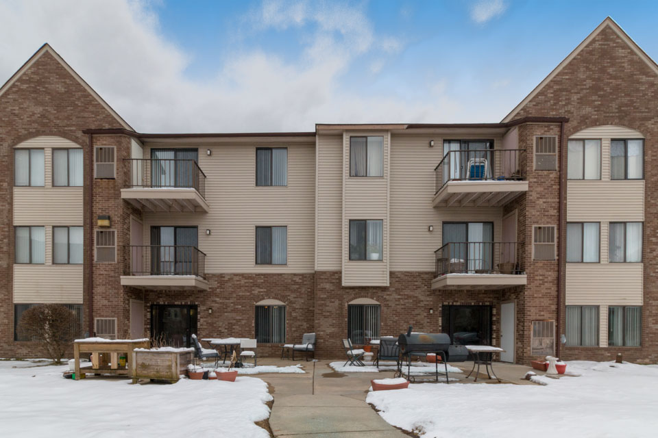
The exterior of American House. Some rooms come with a balcony! Also, notice the patio area. A great place to hang out when it’s nice weather.
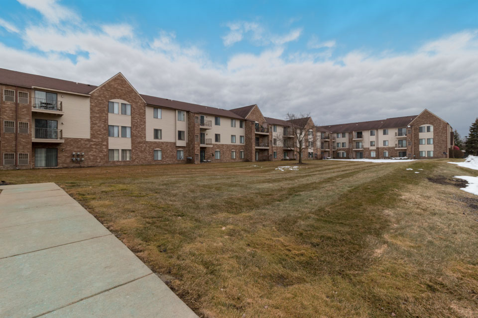
A wider shot of the premises.
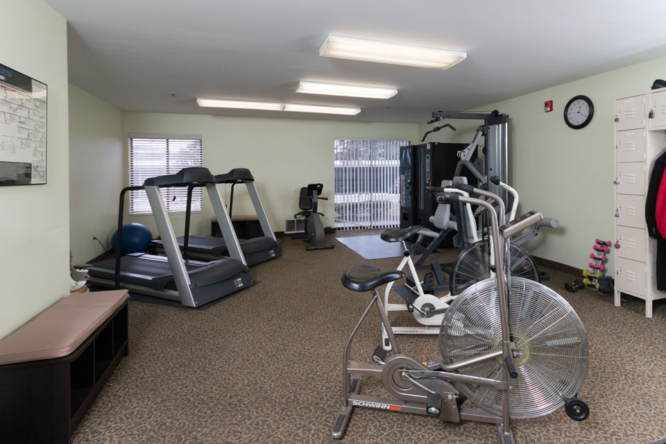
American House’s gym for residents to exercise.
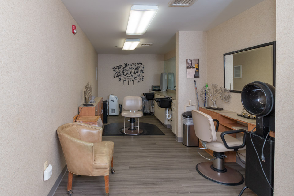
Of course we stopped by the hair salon!
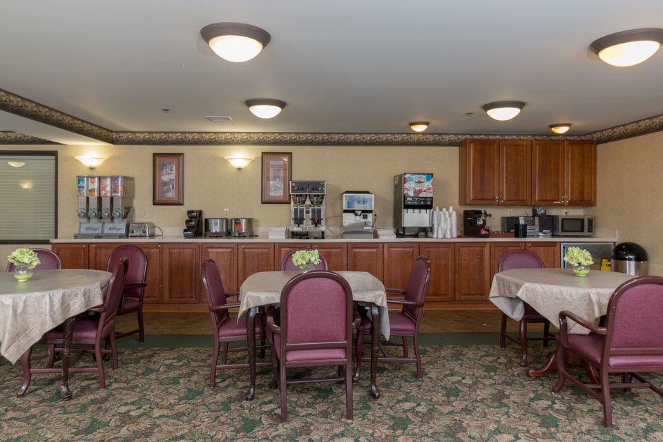
A look at the dining quarters.
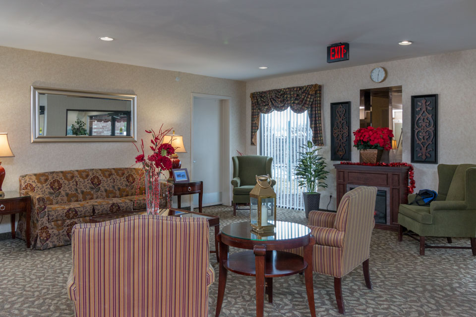
This is one of the common rooms for the residents to hang out in.
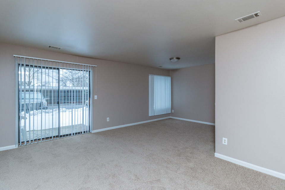
A look at the main room with sliding glass doors leading outside.
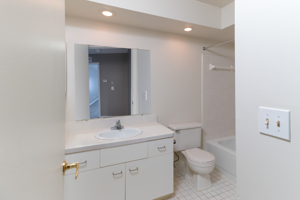
The bathroom with a shower included.
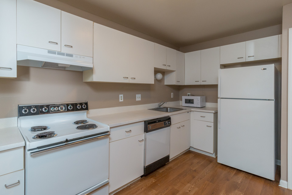
The kitchen of each room has all the necessary appliances and tons of cabinet space.

Here is the Google Business Tour for Henry Ford Quick Care Clinic in Detroit, Michigan. We especially love touring medical facilities because we know clients are given peace of mind being able to see where they will be during their appointment. To be able to see where everything is and what the environment is like is enough to settle someone’s mind who may be nervous or uneasy. Take the tour below!
I had the opportunity to photograph this beautiful condo in South Canton for Jason Borregard from Clients First Realtors and used the shots to put together this informative slideshow video. The exterior of the condo is a combination of brick and stone, giving it a home-y, welcoming vibe. As soon as you walk in, you’re met with grand ceilings and natural light from the large window above the front door. The kitchen has been updated with modern stainless appliances and dark mahogany cabinetry. This condo has two bedrooms (one of which has a fireplace!), two bathrooms, two half bathrooms (the dream!), and a finished basement! Don’t just read about it, though. Check out this video to see for yourself what a charming place it is!
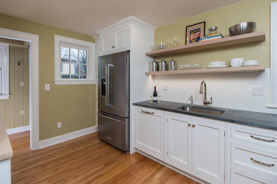
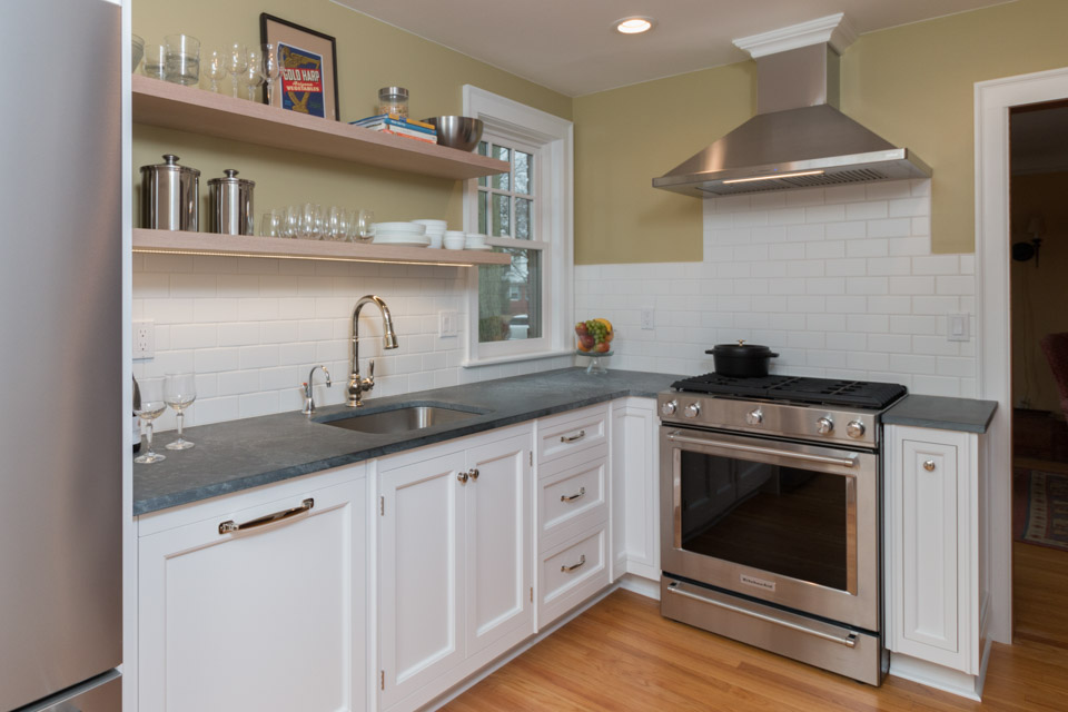
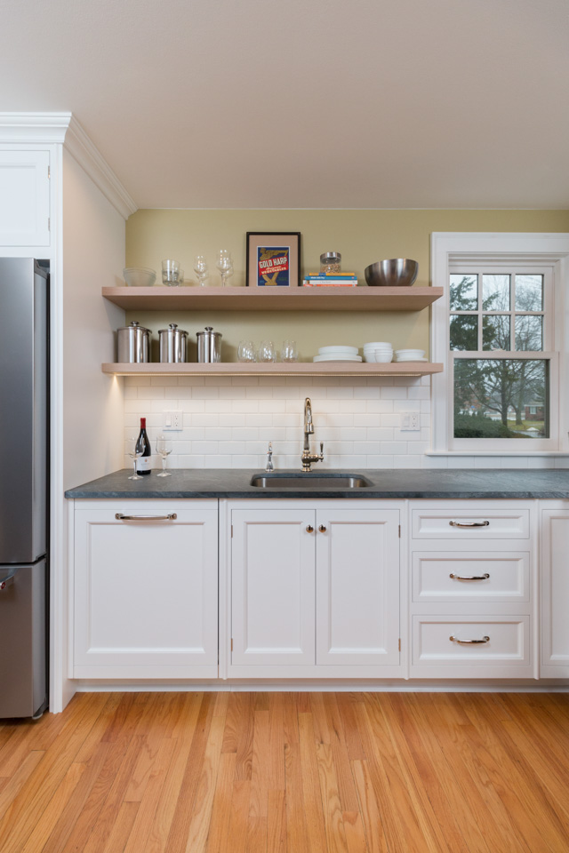
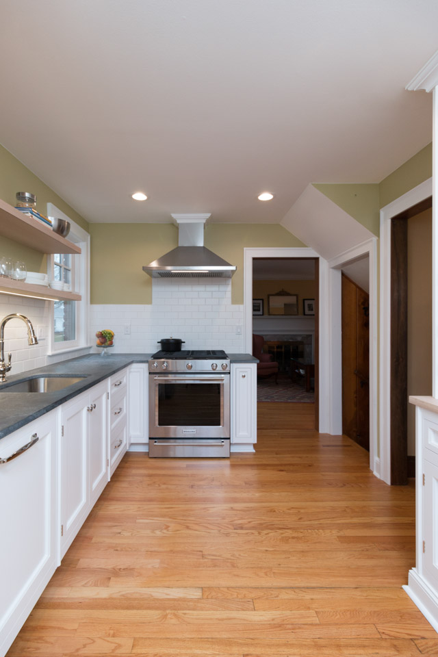
Sharer Design Group focuses on transforming kitchens and bathrooms into spaces their clients will love. They remodeled a kitchen in a Livonia home and we were happy to capture the finished product! Let’s check it out.
From this angle, you can see the many details of the kitchen: stainless steel fridge, wood floors, dark counter top contrasting with white cabinetry, and white tile back splash.
Here’s a look at the other side of the kitchen. The stove fits with the stainless steel theme.
The double shelves are a nice touch to the remodeled kitchen.
From this angle, you can see the entire kitchen.
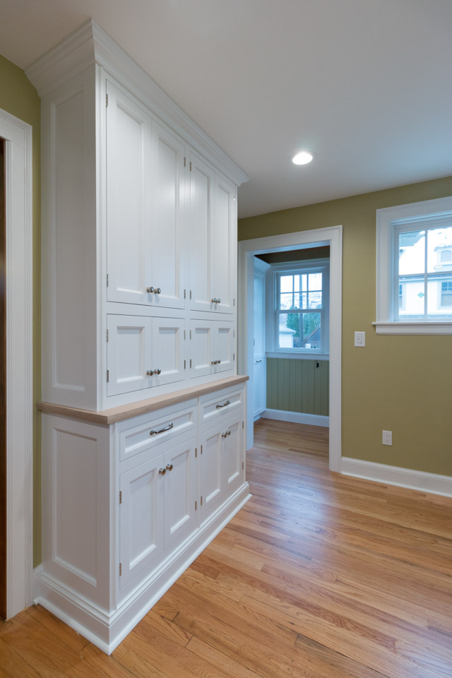
Because this is a smaller kitchen, they now have this large floor-to-ceiling cabinet for extra kitchen storage!